NIPN sub-national nutrition dashboard
-
Introduction to the NIPN Dashboard
Multiple sectors contribute to the immediate, underlying and basic determinants of nutrition and play a role in addressing undernutrition. Frequently, however, nutrition-related information is collected through separate surveys and studies, conducted by different institutions and agencies, and the results are presented in separate reports. One of the objectives of NIPN is to bring together information from diverse datasets to facilitate a multisectoral analysis of the nutrition situation.
The information generated from this multisectoral analysis needs to be presented in a clear and simple format so that all stakeholders - including those not used to working with numbers - can understand the key messages. This tool provides a template for a sub-national nutrition dashboard which presents information from multiple sources in a visual format that can be easily understood.
Nutrition indicators, as well as intervention coverage and other factors, can vary significantly across regions (provinces, districts, counties). The sub-national dashboard helps to quickly identify variation within a region and specific issues relating to that region in order to support policy makers in defining their priorities.
The use of the NIPN Dashboard is optional, but may be considered to help countries achieve the following objectives:
- To initiate dialogue between policy makers and data analysts regarding multisectoral nutrition indicators, programmes and investments.
Initiating a dialogue between data analysts and policy makers from different sectors can be challenging and lengthy. These groups may not be used to joint discussions and may be hesitant to start the dialogue unless there is clarity about the relevance to their work. By presenting nutrition data at sub-national level, the dashboard helps to stimulate discussions and start the dialogue. - To quickly produce an initial multisectoral analysis of nutrition-related information at sub-national level.
The dashboard contributes to quickly establishing the credibility of the NIPN. The flexible format allows for adaptation to the country’s needs, in terms of including or excluding indicators, formulating appropriate messages and highlighting relevant questions for discussion.
The NIPN sub-national dashboard is for use by:
- Data teams who can adapt and complete the NIPN Dashboard template using data from their country.
- Policy makers at national and sub-national levels from the different sectors related to nutrition, in order to stimulate a policy dialogue.
This guidance note includes:
- A set of “characteristics” for the dashboard, based on a review of existing dashboards and on the specific objectives.
- A set of indicators that each country can adapt to their requirements and priorities.
- A review of challenges and solutions.
- An Excel template to easily produce a visual dashboard.
*****Note about sub-national divisions - To initiate dialogue between policy makers and data analysts regarding multisectoral nutrition indicators, programmes and investments.
-
Characteristics of the NIPN Dashboard (1/4)
Based on a review of existing nutrition dashboards (see below) the following characteristics are found to be key for the NIPN Dashboard:
- Country owned and appealing to all sectors
- Flexible format, easy and quick to produce
- Clear, easy to read and understand
- “Tells the story”, with questions to stimulate discussion and reflection
- Time trends and geographical comparison demonstrated, depending on data availability
- Aligned with SUN MEAL dashboard
These essential characteristics of the NIPN dashboard are further described in the following pages.
*****More information about the dashboards which have been reviewed -
Characteristics of the NIPN Dashboard (2/4)
1. Country-owned, appealing to all sectors
The NIPN country teams are responsible for populating the dashboard with data.
Country teams can adapt the NIPN Dashboard template to their own country context and requirements:- The template provides a solid starting point but country teams choose to include or exclude indicators and to formulate key messages and questions for discussion, tailored to their specific needs and priorities.
- The dashboard is designed purely for in-country use, and not set up to compare indicators across countries.
Potential users come from different sectors. The dashboard aims to include indicators related to the determinants and interventions of various sectors (social protection, water and sanitation, health, agriculture).
Users should be able to visually identify the sections of the dashboard which are of specific interest to their sector.*****2. Flexible format, easy and quick to produce
The NIPN data analysis team can add, exclude or modify indicators as appropriate to the country context, but needs to take account of the time frame. Be mindful of producing the dashboard within a reasonable time frame.
- The dashboard can be used as a starting point to initiate policy dialogue, though the country team will choose whether and how to use it.
- The dashboard offers a quick way of starting to implement the NIPN approach. The initial dashboard therefore does not need to be complete or perfect.
- Too much time spent on debate about whether a particular indicator should be added or removed from the dashboard delays completion and initiation of policy dialogue.
- A reasonable time frame depends on the timing of key opportunities for policy dialogue (e.g. the development of next year’s budget, or the new 5-year strategy) and the time needed to populate the dashboard with reliable data.
- The dashboard is expected to lead to better understanding and additional questions which will increase country ownership. As policy questions and more in-depth analysis become available, the dashboard will evolve over time.
***** -
Characteristics of the NIPN Dashboard (3/4)
3. Clear, easy to read and understand
Users often have limited time. Therefore, the dashboard needs to be short (4-6 pages), simple and clear so that reading through the main messages will only take a few minutes.
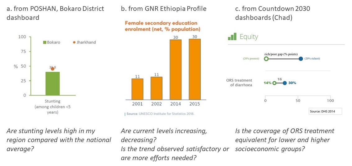
The target users of the dashboards are not necessarily data experts nor used to complex graphs and messages. This needs to be taken into account when presenting data:- Bar charts are usually well understood (see example below)
- Confidence intervals are rarely fully understood
- Complex charts are less easy to understand (see example below)
- Common language must be used to explain the meaning of the indicators, with as little technical or scientific jargon as possible
*****Example 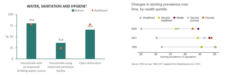
Simple bar chart from the POSHAN initiative (left) and complex representation from the Global Nutrition Report (right)*****4. “Tells the story”, with questions to stimulate discussion and reflection
The dashboard needs to clearly guide the user in a logical flow of information:
- The different areas of the causal framework of nutrition (Lancet, 2013) are used (“Immediate causes”, “Underlying causes”, “Nutrition-specific interventions”, etc.) as a basis for organising the dashboard.
- The impact pathway logic has been adopted in the dashboard and is explained in the introduction to the NIPN approach. This is used to “tell the story” and spell out the link between inputs (e.g. financial and human resources) which are invested in activities (programmes and interventions) to influence the determinants of nutrition (immediate, underlying, basic) and result in a positive impact on nutrition indicators.
- The messages conveyed in the dashboard can be strengthened through discussion or presentation, especially with non-nutrition specialists.
- In order to initiate dialogue with policy makers, it is crucial to identify key discussion points which emerge logically from the data presented. Examples of questions have been inserted in the dashboard, but can be modified to reflect the national nutrition priorities identified in the multisectoral plan of action for nutrition.
*****Example Points for discussion from the POSHAN initiative:- How can the district increase rates of woman literacy and reduce early marriage?
- How does the district perform on providing drinking water and sanitation to its residents? Since sanitation and hygiene play an important role in improving nutrition outcomes, how can all aspects of sanitation be improved?
- How does the district fare on food security?
***** -
Characteristics of the NIPN Dashboard (4/4)
5. Time trends and geographical comparison demonstrated, depending on data availability
- Data from one point in time are useful for comparison with national figures (see example a).
- Data can be presented which illustrate changes in an indicator over time (see example b)
- More in-depth analysis such as looking at inequities in nutrition indicators are possible (see example c).
*****Examples Key messages:
- In-depth analysis should avoid over-complicating the graphs and message.
- The dashboard should be easy to produce.
- The dashboard balances in depth-analysis and clarity.
*****6. Aligned with SUN MEAL dashboard
The dashboard has been developped in close collaboration with the SUN MEAL team.
- The SUN MEAL system has been designed as part of the Scaling Up Nutrition (SUN) Movement.
- It includes a comprehensive list of internationally well-defined, well-accepted, well-known and publically accessible indicators, which provides an excellent basis for the NIPN Dashboard.
- The NIPN Dashboard template has been designed to include most of the indicators from the SUN MEAL system. It can potentially fulfil the objectives of both the NIPN and the SUN MEAL.
- The SUN MEAL system specifically monitors the progress of the SUN Movement, across all SUN countries. Some indicators or sections may therefore not be fully relevant for in-country use and have therefore not been included in the NIPN Dashboard template.
- Moreover, the SUN MEAL indicators have been selected on the basis of universal public accessibility. The NIPN is not restricted by this and additional indicators accessible at country level to the NIPN team can be added.
***** -
Presentation of the NIPN Sub-national Dashboard
The Lancet Nutrition Framework was the starting point for the development of the NIPN Dashboard.
The framework sets out the basic, underlying and immediate determinants of undernutrition. It also lists the nutrition-sensitive and nutrition-specific interventions which are known to be effective in addressing these determinants.
The framework helps to describe the multisectoral pathways that contribute to undernutrition and the range of programmes and actions relating to different sectors which contribute to nutrition improvements.
The indicators of the NIPN Dashboard are categorised in domains which directly reflect the Lancet Nutrition Framework. There are two differences though:
- The NIPN Dashboard adds an important element: “Finance for nutrition”.
- The NIPN Dashboard merges “basic” and “underlying” causes into one domain.
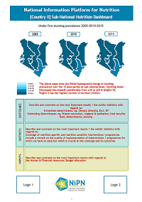
The visual below illustrates the construction of the NIPN Dashboard and the images underneath show the content of the NIPN Dashboard.
*****How has the NIPN Sub-national Dashboard been built? <video_responsive211|center>
*****Visualisation of the NIPN Dashboard template Note: data in the template are not real data.
***** -
Challenges and solutions (1/2)
Though the dashboard template is meant to help produce a tailored sub-national dashboard quickly and easily, there are of course a number of challenges, of which the main ones are discussed in the following pages:
- How to select the indicators of the dashboard
- Data availability at sub-national level
- How to ensure data quality
*****Challenge 1: How to select the indicators of the dashboard
The NIPN Dashboard template is based on a set of indicators derived from the Lancet Nutrition Framework and the SUN MEAL system.
This list of indicators can / should be adapted or completed based on:- National or sub-national nutrition priorities.
- Availability of data. Many of the indicators in the dashboard are selected because of their availability in Demographic Health Surveys (DHS). However, specific national surveys may exist which contain other relevant indicators. It is worth exploring these possibilities. The Data Landscape Exercise (see section 3.1) may offer a good starting point.
It is strongly recommended that the number of domains and indicators are restricted to enhance the visual quality and readability of the dashboard and to ensure that key messages are highlighted.
In other words, use its flexibility and make the dashboard context-specific but keep it simple to deliver a strong and clear message.*****Challenge 2: Data availability at sub-national level
Most of the indicators in the dashboard are available in the standard DHS & Multiple Indicator Cluster Surveys (MICS), which are based on representative samples of the population at the sub-national level. This is, however, not the case for all data available.
Financial investment information in relation to nutrition is often not available at national nor sub-national level. Meaningful proxy indicators can be elaborated based on the data available (for example, % of budget spent on health per region or total amount invested in a national IYCF programme per region per stunted child).
Similarly, with regard to underlying and basic determinants, there is no global standard for essential nutrition-sensitive interventions impacting these determinants and thus it is a challenge to identify meaningful indicators. Each country should identify relevant and meaningful indicators for its own situation (for example, a country with an established social protection programme may want to include the coverage of that specific programme).
When data for key indicators are not available, the NIPN team can choose to:- Include it in the dashboard as “missing information” to highlight the need to include this indicator in the Monitoring and Information System, or a specific survey.
- Replace the indicator by a ‘proxy’ indicator.
***** -
Challenges and solutions (2/2)
Challenge 3: How to ensure data quality
It is critical that the NIPN provides reliable data to build the credibility of the initiative.
There is no magic bullet regarding data quality. Rather, a rigorous process is adopted to define whether the quality of the data is sufficient for it to be included in the analysis and to allow reliable and coherent interpretation.
This rigorous process needs to answer the following questions:- Which data quality control mechanisms have been implemented for this indicator? Do these mechanisms consider multiple aspects of data quality (training, sampling design, differences between surveyors, outliers, etc.)?
- Is there a data quality section in the survey report? What does it say? (For example, National Nutrition Surveys following the SMART methodology should produce a data plausibility report with an overall score).
- Are there regional disparities in data quality? (For example, during a national survey, the access for logistic or security reasons to one region may have been difficult. The sampling may have been excellent in 9 regions and poor in 1. This is not a rare situation. For providing a national prevalence this may be good enough; for providing a regional prevalence this can be problematic for the region in question).
- Are the data coherent with other sources of information?
- Are the data over-interpreted given the data quality?
Always:
- Do the homework: never take data quality for granted. Rigorous data quality assessment allows the user to have confidence in the data analysis and the results when presenting them to policy makers, and to be able to respond rigorously to any doubts about data quality.
- Be consistent in any decision to drop certain indicators and keep others. Decide collectively on the basis of well-defined criteria.
- Be conservative: in the case of doubt regarding data quality, the best and only choice is to leave out that specific indicator from the dashboard.
- Be transparent: the dashboard should provide sufficient information (definition of indicator, geographic scope, year, source of information) to allow every user to reproduce the dashboard with the same data.
Refer to section 3.3 for guidance on anthropometric data quality.
***** -
Templates to produce the NIPN Sub-national Dashboard
The Dashboard is meant to be a flexible tool, which can be altered dependent on the priorities and focus of the policy dialogue in a specific country. NIPN country teams, in close collaboration with the MAC, will have to decide which indicators they want to keep, remove or add to their dashboard based on the defined priorities.
An Excel template forms the basis of this NIPN sub-national nutrition dashboard. The macros included in the Excel template allow for rapid and easy production of a country-specific dashboard, and should not be altered.
Each NIPN country has received a customised Excel template, including its country map with a first level of sub-national administrative divisions.
The Excel template has been completed with data from an anonymous country to provide a mock display on the dashboard.Notes:
- Each country must replace the mock data with its own, real data to produce its sub-national dashboard.
- It is recommended to keep a back up of the original Excel template, at all times, in case unintended alterations damage the macros or corrupt the template.
*****NIPN Sub-national Dashboard Excel template Notes:
- Data in the template are not real data
- Excel 2016 is needed to use the map of the dashboard
*****